Building Personas for Pho Que Huong
Overview
I researched how to promote and enhance local chain restaurant sales via website and marketing strategy.
Design research helped me in understanding who goes onto Pho Que Huong’s different web pages, for what purpose, and how they dine in/out on a day-to-day basis.
My Role
Independent Researcher and UX Designer
Partners
Pho Que Huong Restaurants
Topic
Market Research, Customer Experience
The Challenge
I needed to connect business objectives to web usability issues for a secure partnership.
Communication of Research
Showing impact and potential value add of design for business impact
Design Maturity
Presenting information to non-tech retail/commercial orgs. means focusing on impact and timeframe payoffs
Local Chain Concerns
Taking time and attention away from their 9 locations to focus on marketing and web strategy
Organizational Management
Connecting with retail adds time, leadership, and budget concerns for both sides of partnership to manage
I began this research assessment to analyze the usability of the website in terms of navigation, the ability to find relevant information to communicate with the client was a new skill — shifting from a designer to business impact focused 3rd party.
The Process
-
Research Proposal
Initial pitch, methods, and goals for the web research
-
Surveys & Interviews
Research guides for client roadmapping and review
-
Research Compiling
User research complied to create a persona
-
Report & Next Steps
Developed a set of recommendations for client
Research Proposal
I provided a web benchmark to gauge the usability issues, and looked forward to next steps.
-
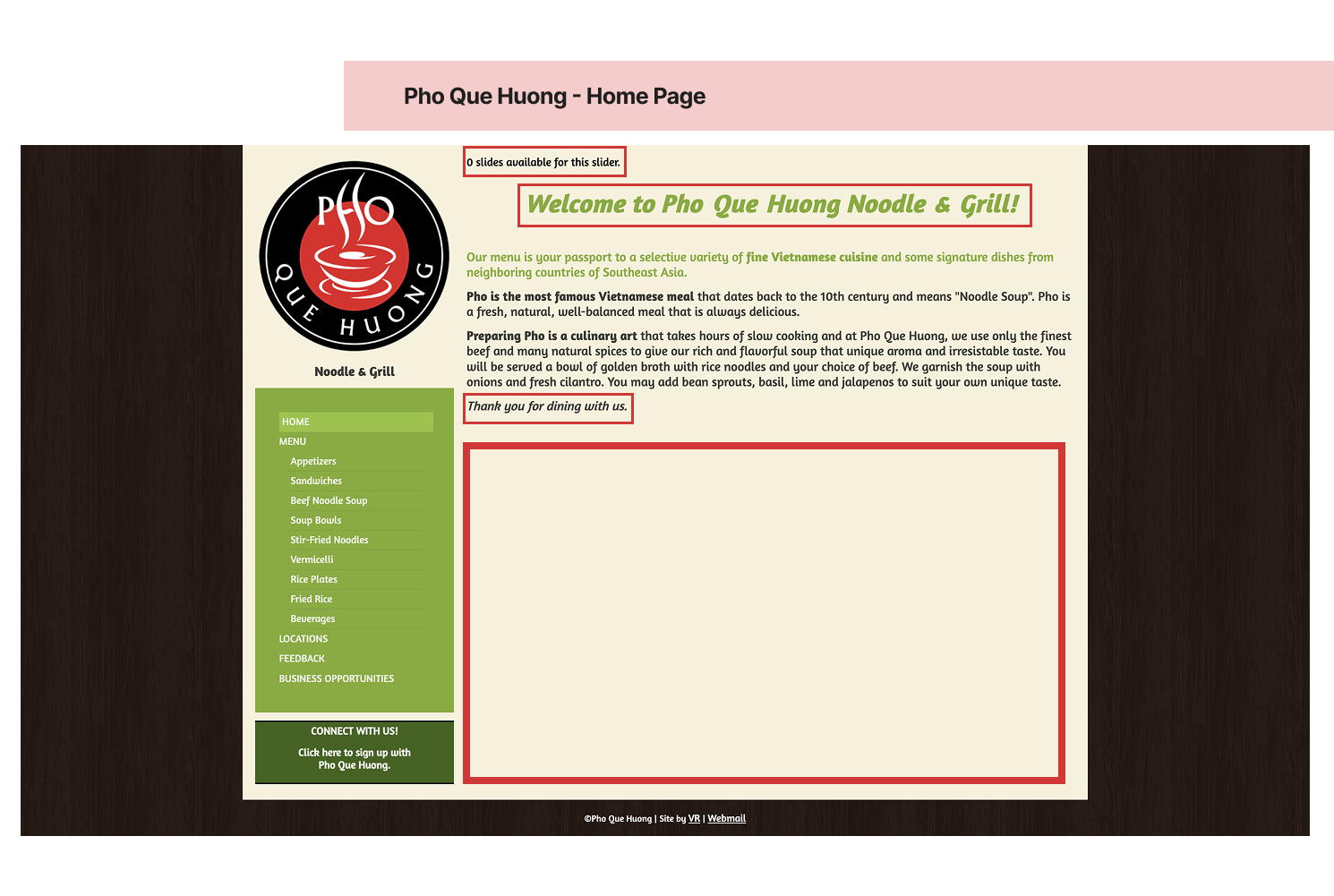
The initial entryway to a restaurant is typically with a warm welcome which is consistent via the welcome and farewell messages displayed on the upper third of the website.
The highest line of text within the website shows “0 slides available for this slider” this positioning, text, and message may lead users to believe that the website is not fully loaded or missing information.
Typical web conventions greet users with hero images, animations, hot buttons and overall a call to action for users to take.
-
Removing the top-most text component to alleviate ambiguity on the initial web navigation for users.
Adding a call to action for users to best navigate, order, or utilize the platform as best idealized by Pho Que Huong.
Filling blank space by introducing a clean hero image that integrates the history of restaurant/Pho
Providing clear path to communication for users via phone/email
Benchmark Outcomes
Identified 5 potential obstacles that users faced
Suggested 4 improvements to enhance CRO
Evaluated the overall accessibility of the website
Establishing clear research goals and timeframes established credibility, trust, and a shared vision with the client on what would be possible with the project from pitch to completion.
Surveys and Interviews
I went about understanding my client’s perspective to prioritize goals, user testing methods, and overall communications.
Product Research Plans
4 Think Aloud Protocols
Scheduled and conducted 5 Card Sorts
Expert Evaluation - Consistency and Standards
I set and communicated research goals, guidelines, and timelines to ensure partner engagement.
User Testing Methods
The 20 users engaged were ages 24-44, from the DFW area
Screeners were on location, ages, and flexibility to try new meals
All participants were self-described “foodies” or would frequently dine outResearch Goal
Verifying user behaviors when ordering online with each location
Participants were asked to show their meal ordering process when at home or work
Some opted in for many research methods to provide more contextI went about understanding my client’s perspective to prioritize goals, user testing methods, and overall communications.
Compiling Research
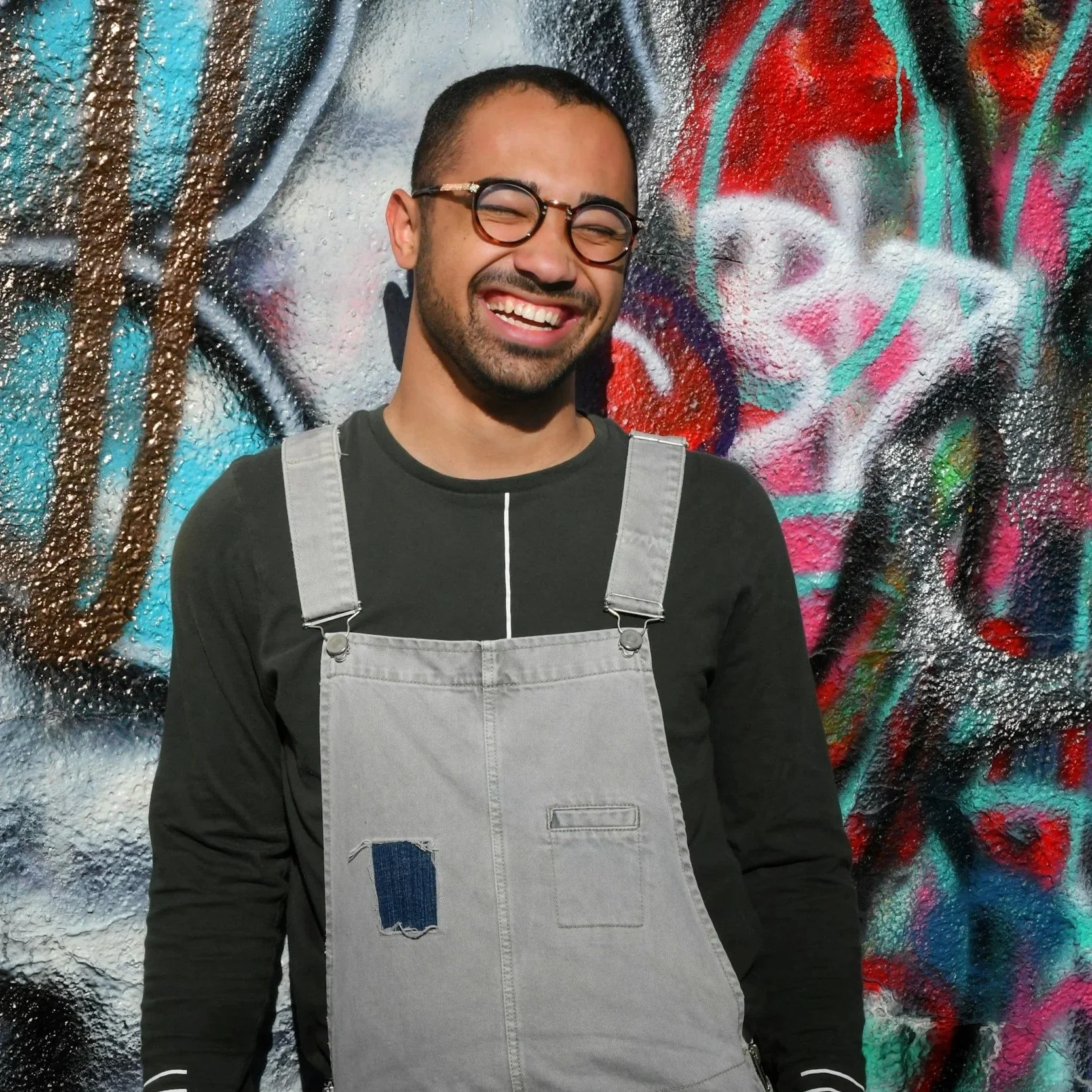
About Ignacio:
32year old art director in DFW
Wants to enjoy all things in life, dining, art, and his community
Research Metric Outcomes
31% of users consistently reported the restaurant website was a tool to see the menu while 37% of users would prioritize food orders
While the menu is listed on the website there can be more in depth listing of allergens in any one platters ingredients.
Users commonly used their mobile web browsers to place orders and this may be a good addition to the website as shown by user data.
Pain Points
Finding convenient local meals in new areas
Reserving last minute dining spots with friends/colleagues
Establishing clear research goals and timeframes established credibility, trust, and a shared vision with the client on what would be possible with the project from pitch to completion.
I shared customer perspectives and insights for potential web improvements and small actionable steps.
User Testing Insights
The website was informational, but not engaging or clear
Presented user feedback as business impact focused information and action
Results were presented as a persona, status report, and web updates
Persona — Ignacio Diaz
DFW foodie who enjoys cooking, trying new foods, and more
Orders food at times and prefers to have authentic, local, and spicy foods
Dining habits were focused around work habits, travel locations, and home
Report and Next Steps
I gave tactical steps on web presence and delivery/ordering platforms based on research insights.
Client Deliverables
Web Recommendations
Heuristic Evaluation
User Journey Map
Average Client Persona
Project Outcomes
What did they act on?
Updated Website
Enhanced Pages onMobile Platforms
With users relying on external apps to order, the client’s best option for an improved customer experience was to optimize Google Maps ads, web copy/styling, and
Web Recommendations
Variety of behaviors in online orders call for consistency of platforms in each location
Listing ingredients, clear location ID, and consistent mobile order process is key for website sales for all locations in the chain.
Match the product to external web conventions in a home page via directive prompting and actionable next steps for new users.
Developing a new section or page for the industry or business partners who need to access the product while users interact with a separate set of sections or pages.
Menu item descriptions as a whole should enhance the user awareness of menu items with well listed ingredients and allergens
After providing tactical steps the client decided to make their own changes and web enhancements.
What I learned
-
Considering alternative contexts behind intended and being planning for user types. (Doordashers, In-Person diners etc.)
Anti-Personas or Fringe Users
-
Being open to reassessing and leveraging the social networks available to me in recruitment and testing.
Communities and Data Gathering
-
Critically understanding the usability and task completion needs within the real contexts of different users.
Information Processing and Intentions